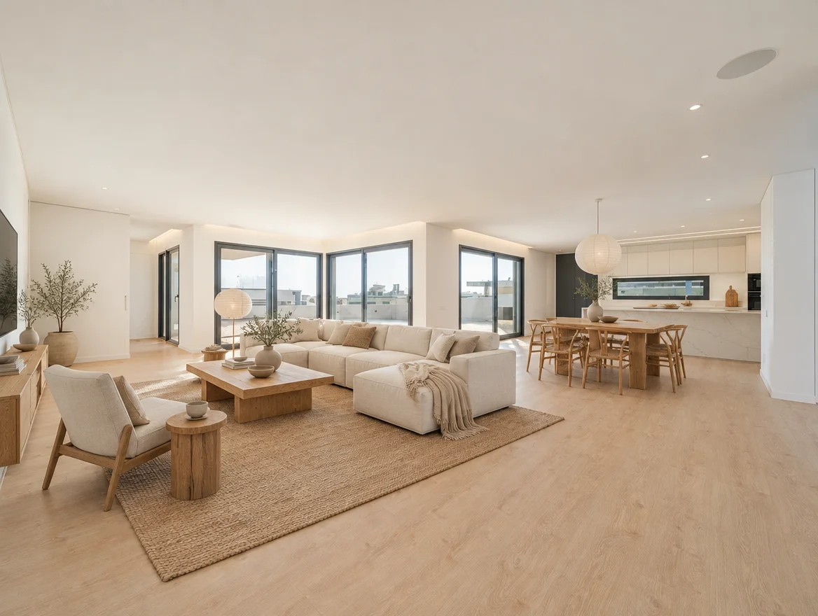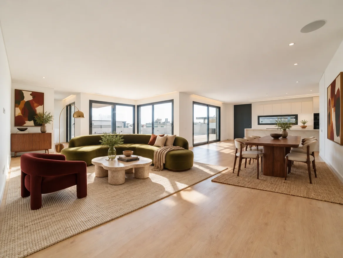
Japandi, minimalist or Scandinavian?
Japandi pairs low timber furniture with natural textures. Warm minimalism adds softer forms; Scandinavian design favours pale wood and practical pieces. Compare them in your own room.
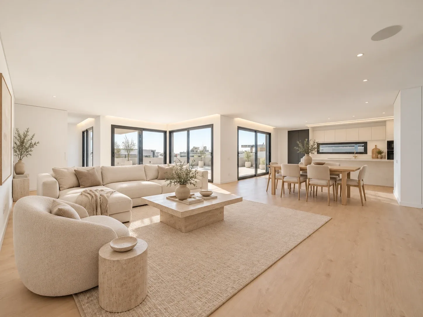
Start with the room, then choose a label
These style names are starting points for a brief, not strict rules. The same linen sofa or timber table could work in more than one direction. Your floor, natural light, existing furniture and daily routine will shape the result more than the label alone.
Choose one source photo and identify what must stay. Keep the palette consistent for the first comparison so the differences in furniture forms and visual density are easier to judge.
Try Japandi for restrained forms and tactile materials
Our Japandi preset combines low timber furniture, natural materials and a restrained arrangement. Ask for a few distinct pieces rather than filling every wall. A woven rug or textured fabric can add interest without introducing many competing colours.
A useful brief is: keep my oak floor and existing sofa, add a low timber table, quiet natural textures and one reading chair. If low seating would be uncomfortable for you, say so in the brief. A style preference should still accommodate how you live.
Try warm minimalist for softness without visual clutter
The warm minimalist direction emphasises natural linen, warm timber and inviting organic forms. It can be a useful comparison when you like a calm room but do not want it to feel stark.
Name the warmth you want: ivory upholstery, walnut, textured curtains or a rounded table. Be specific about what should remain plain. Asking for soft textures and clear surfaces is easier to evaluate than asking only for a luxurious minimalist room.
Try Scandinavian for a lighter everyday palette
Our Scandinavian preset uses pale oak, white and dove grey, wool textures and simple functional furniture. Test it if you want a lighter visual direction, then compare whether that palette works with your existing floor and the light in the actual room.
Avoid treating a bright rendering as evidence that the room will receive more daylight. Review changes to windows, exposure and shadows. Paint and fabric samples in the real room are the next step once you have selected a direction.
Compare the three options using the same questions
Save each concept with the same original so you can compare them directly. Look beyond which image is most striking: the useful choice may be the one that keeps more of your existing furniture or requires fewer purchases.
- Which pieces can I keep in this direction?
- Does the furniture arrangement support how I use the room?
- Do I like the materials individually, as well as together?
- Can I find suitable pieces in the right sizes and price range?
- Which colour samples should I test at home?
Use the style gallery as a starting point
The design guide includes 18 interior directions, including Contemporary Italian, Modern Portuguese, mid-century modern, Mediterranean, coastal and collected colour. If none of the first three feels right, change one element in the brief before starting over.
Rendered colours and materials are visual suggestions. Screen settings, lighting and generated texture can differ from physical samples. Verify those details before ordering.
See how it works ↗See examples ↗See pricing ↗
Based on our Studio workflow and concept examples, not completed customer projects. Send a question or correction.